24 March 2010

will it never, EVER, end?

"what a looooooong strange trip it's been" for me and this here dining room. it was probably the room i was most excited about when i moved in - not because it is the most beautiful (in fact, it was the most neglected - i can't even conceive of what those college kids were DOING in there.*), but because i love to entertain.

*okay, i really can because, you know, it wasn't SOOOOO long ago that i was a college student myself. i just don't want to imagine those things happening in MY dining room!

from the start, i wanted it to be a cozy room that people could relax in for hours. it started as this mess below - well this is actually after the carpets full of funk were removed. i can't find a better photo, i think, because i had avoided the room for so long.

again with the baby-poopy yellow. EVERYWHERE with the baby-poopy yellow. to make it a bit more serene i decided to go for a mid-tone gray. i tested about 10 and chose the one you see below. (again, apologies for the mess - until the basement is cleared for use, the dining room is doubling as a storage unit.)
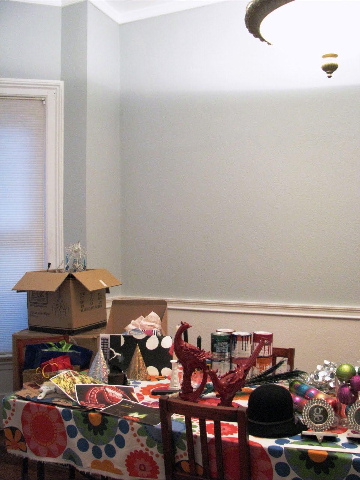
i tend to like cool colors, but this just looked horrible. i had exchanged the poopy baby diaper color for an actual baby's nursery (which is just sad and scary if you don't have a baby friend of your own)!

when it went on, it was a pale blue and i hated it. but i was so frustrated that i just finished off the room because i had no idea when i would get to painting it AGAIN....

in the meantime i found this amazing photo. noe this - THIS - is what i was looking for. so, against my usual color instincts, i went about testing some dove grays - colors that had a bit of brown in them to warm things up and create that cozy vibe i want. i finally settled on "stormy monday" by benjamin moore.

and, last night, i got my lazy bones off of the sofa and painted one wall to see if it worked...

i also dedided to do something a bit radical - i'm painting everything from the crown molding down in this color, including trim and baseboards. I'll be using alot of white, black and gold decor - and texture - for POP.

i like that it's neutral enough to show off any color that i might incorporate into holiday or party decorations. because you know me, with the color. and the sparkle.

what do you think? great or BIG mistake?

OH - quick side note... i decided to try a new paint formulation last night as well: benjamin moore's aura. it's alot more expensive than the color-matched paints i generally buy at home depot (which are great), but i did love this stuff. goes on very smooth, great coverage, and very low on fumes. thumbs up!


15 March 2010

color me beautiful.

okay, friends, i'm not even the teeniest bit ashamed to admit it: i heart bridget jones.

bridget reading one of my favorites, house & garden magazine

the first time i read the first book i laughed so hard i cried. there are so many reasons to love her, not the least of which is her relationship with her mother.

when i started on my latest mini project, picking pillows for the sofa, i couldn't help but think of this gem:

"I'm taking you to have your colors done! And don't keep saying, 'what,' please, darling. Color Me Beautiful. I'm sick to death of you wandering round in all these dingy slurries and fogs. You look like something out of Chairman Mao." (click here to determine your "season".)

sometimes (a lot of the time, actually) mother really does know best. rather than a house full of dull colors and boring pieces, i want a house full of COLOR and HAPPY.

so, when i was packing up ye ole christmas decorations (in february - that's right, people, i said february), i realized that i had stumbled upon the perfect palate for my living room accessories. i mean JUST LOOK at this picture. don't the colors make you smile from the inside out? (if you said no, you might be dead inside. get help!)


here's a closer look at the decorations (please ignore the rest of the mess - the dining room is currently my project room).


so cute and cheerful!

i've started to collect and make pillows that approximate this color scheme. there are a couple left to make or acquire, but i like where this is headed!


from left to right:

* fuschia velvet pillow from pier one
* chartreuse beaded pillow from pier one
* homemade (yes - i MADE it) bolster pillow. it's a pretty cream wool herringbone with sparkly gold threads. gussied up with black velvet ribbon and antique lace.
* tube top, yup - TUBE TOP, from forever 21 in an amazing iridescent purple-y blue sequin. popped it over a down insert from west elm et VOILA!
* chinese silk pillowcase procured in chinatown many, many moons ago (2004, i think)

MY adorable mom bought me this amazing purple silk embroidered with butterflies - that'll be the next one.
and i'm still on the lookout for a great peacock blue fabric to balance it all out. any suggestions?


project doorway update: ready for its close-up!

is it sort of pathetic that i'm waxing nostalgic about a project that's not even done yet? (it's okay to say yes. i said yes.)

i have only one room left to paint and that means project doorway is rapidly coming to a close.

so let's raise a glass - scotch if you've got it - to the progress we've made on the paint front over the last six months. here's a retrospective of our work...

the front door, interior:


inside of the downstairs bathroom door:


the inside of the built in nook on the side of the fireplace:


inside of the upstairs bathroom door:


inside of both master bedroom closets:


inside of the guest room bedroom closet:


the back door, interior:


i'm loving this door in nicky hilton's INSANE closet (and i'm SWOONING over those shoes she's wearing). pretty sure that this is what will end up the inspiration for the doors in the dining room...


hope you've enjoyed the close-ups!

"dooooo youuuuuuuuu know what to-day is?‏"

6 months ago, today, we bought this crazy old house. still as fun today as it was then!


i have alot of catching up to do on this blog - i'll promise to write a couple of entries this week. maybe i can even catch you up on project g. a ton of progress has been made!

23 February 2010

youuuuuuuuu... light up my life...

oh, boy! well if that song reference doesn't date me, i don't know what would!

i've had several happy comments of late on the lighting that is happening in my house, so i thought it'd be fun to put all of the new fixtures into one post - along with some ideas for future acquisitions.

a bit of background: the house has a "suite", if you will, of matched lighting in all of the rooms. the set is not original to the house, so i feel no guilt about removing and replacing all of the pieces - esp. since they are HEAVY, both in weight and visually, with antiqued silver borders on huge alabaster-like glass inverted domes.

here's what's going in instead...

in the family room (which i just realized i haven't blogged yet - oy!), this lovely that i scored at lamps plus for over $1100 off of the original price. (yup - you read that right!)


this on the floor of the family room, for times when we prefer to burrow into the couch and relax without too much light. it's almost as soft as candle light - but a lot more fun!


this gorgeous thing that was found in a local barn and sold to me at the fair for a mere 60 buck-a-roos. it now lives in my office - which is far too messy for me to reveal yet!


the ship, the ship! (nope, doesn't have the same ring as tattoo's famous catch-phrase). this is the newest addition to the master bedroom. i know that MANY of you are skeptical but the response, in person, has been overwhelmingly positive. to the tune of "oh my gawd! that is, like, the coolest thing i have ever seen!" even the dudes like it - and, ladies, any way we can ram crystal chandeliers down their throats is A GOOD THING.


just acquired for my guest bedroom - i'm anxiously awaiting its arrival! if the color in the photo rings true, this should be a stunning finishing touch to the room. i foresee many naps under this fixture in my future.

and now for the wish list...

if they would LOWER THE PRICE ALREADY, i would really like to add this pendant from restoration hardware (*swoon*) to my dramatic black and white entry hall. i think it has just the right feel for space and would cast a lovely glow upon my visitors! guess i'll have to scour the resto outlet soon...

or maybe settle upon this one from murray feiss, with a slight asian feel, for one tenth of the cost:


and for my dining room, which i currently cannot stand (hence the lack of photos so far), a fab white milk glass number. remember these inspiration photos? wouldn't this be perfect, along with some thonet no 14 chairs in black? problem is that i am late to the game and this lovely martha stewart confection is LONG GONE. any suggestions on suitable replacements?
and, finally, some vintage-y pendants for the kitchen. i love these - made to look like early electric lamps from the turn of the century. i have plans to dial down the current modern vibe in the kitchen to make it fit better with the rest of this old house, and i think these would be just perfect.

do you have any favorites of your own?


12 February 2010

what do we think?

i'm thinking that this chandelier might be fun for the guest bedroom. it looks like the raindrops are the same color that i plan to paint the desk (i.e. a shade darker than the last ruffle on the curtain).

you dig?

04 February 2010

how do i love thee? (a poster to swoon over.)

valentine's day is fast approaching and it really does seem that love is in the air. i just attended the (spectacular) wedding of two wonderful friends, john and sandra, and *so many* other friends seem to be in love and getting married this year.

it's all so lovely and heart-warming! (sweet lord, is my little black heart swelling à la the grinch - my favorite cartoon hero/ villian?)

speaking of love, i have fallen head-over-heels for this lovely poster.

i found it at a small gallery here in san francisco, artzone 461, during their "six centuries of printmaking" exhibition. i walked in to the gallery and my eye was immediately drawn to this piece - it is so vibrant and quirky and fun!

while little is known about the piece (likely late 50s, early 60s, show produced in amsterdam) steven, the gallery's director, explained that the piece comes from his late uncle's collection - an eccentric with and exceptional eye and a love of purple.

i'm excited to get it framed and use it to anchor the art wall in my living room. any suggestions on framing? i think i know what i'd like to do but i'd love to hear some of your creative suggestions.
Related Posts with Thumbnails

Followers